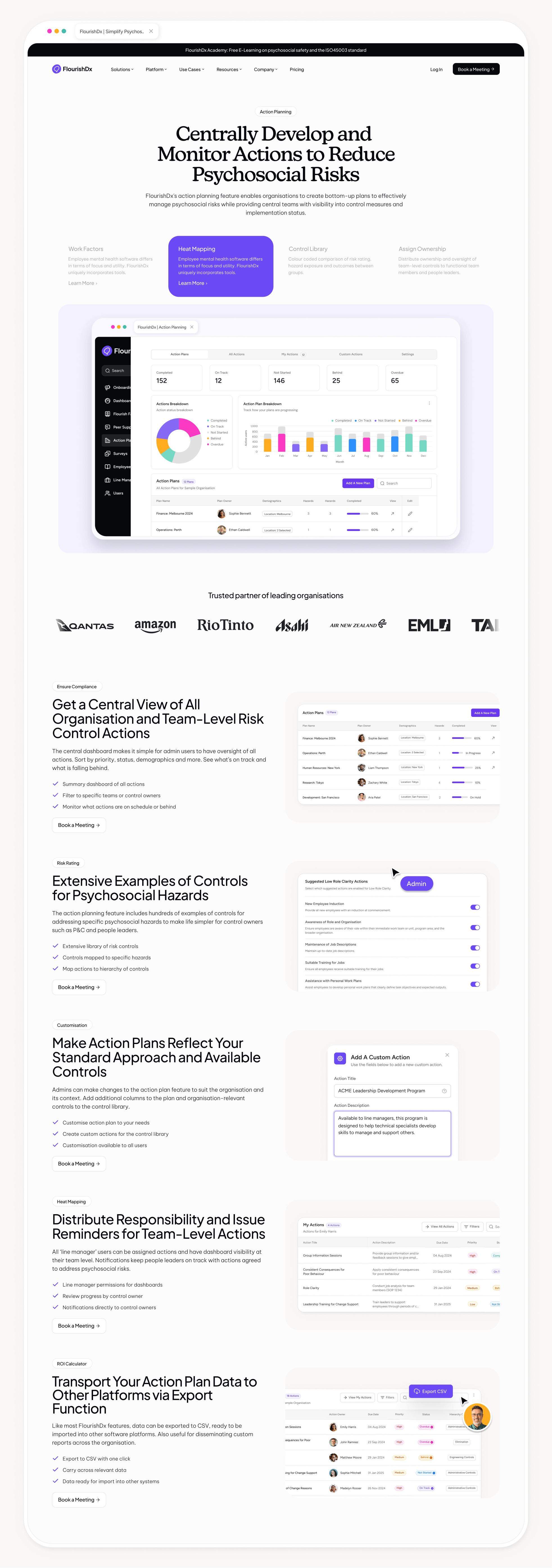
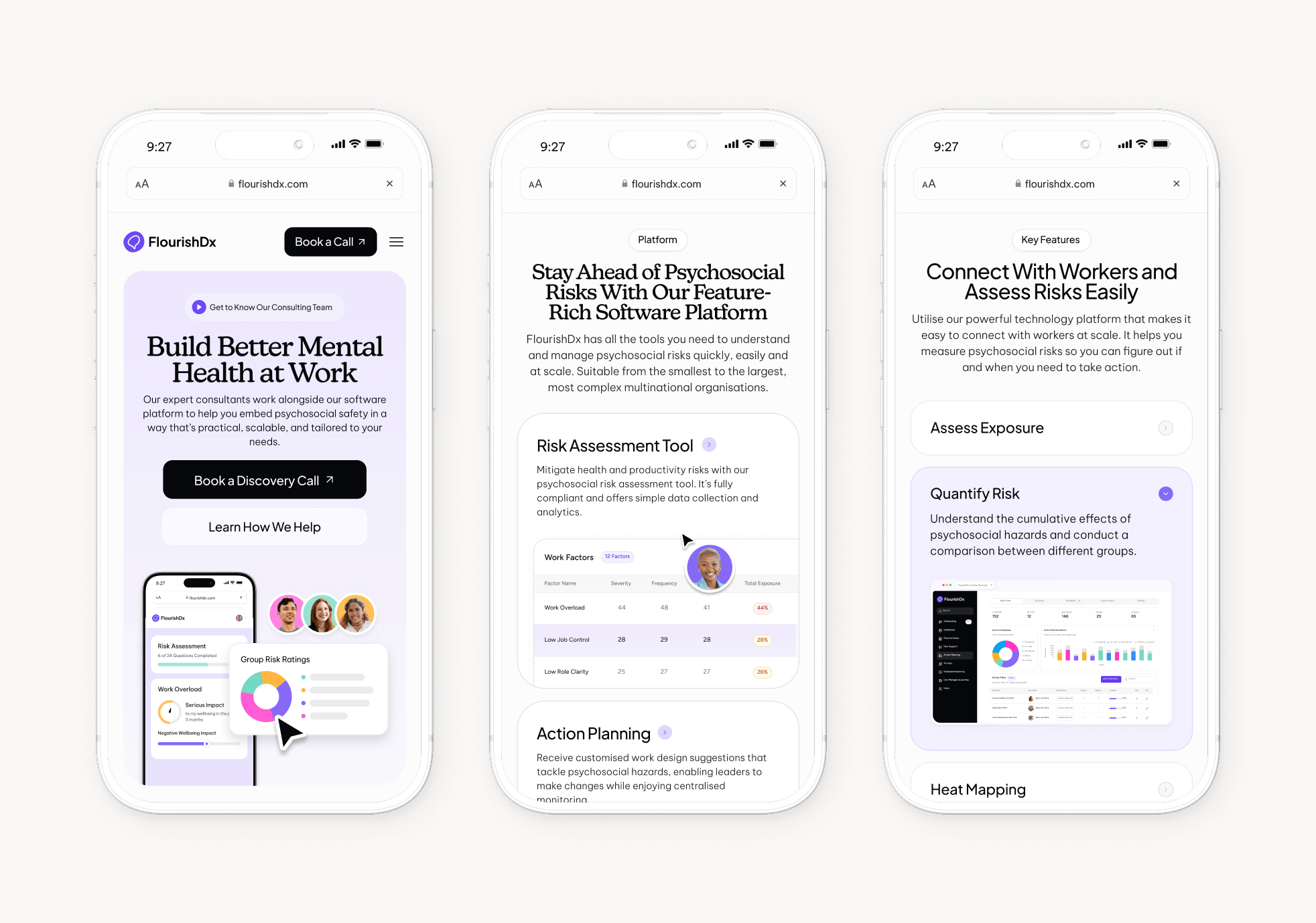
Following the FlourishDx rebrand, the marketing website needed a complete redesign to match the elevated visual identity and clearly articulate the value of a complex, enterprise-focused product.
I redesigned the entire marketing site from the ground up—collaborating on structure and page architecture and defining visual hierarchy, and UI patterns. The goal was to create a polished, trustworthy experience that communicates the dual nature of FlourishDx’s offering: evidence-based consulting paired with a powerful SaaS platform for managing psychosocial risks at scale.
The new website distills a large amount of technical, legislative, and psychological content into an intuitive, modern interface supported by strong storytelling, human-centred visuals, and detailed product imagery.
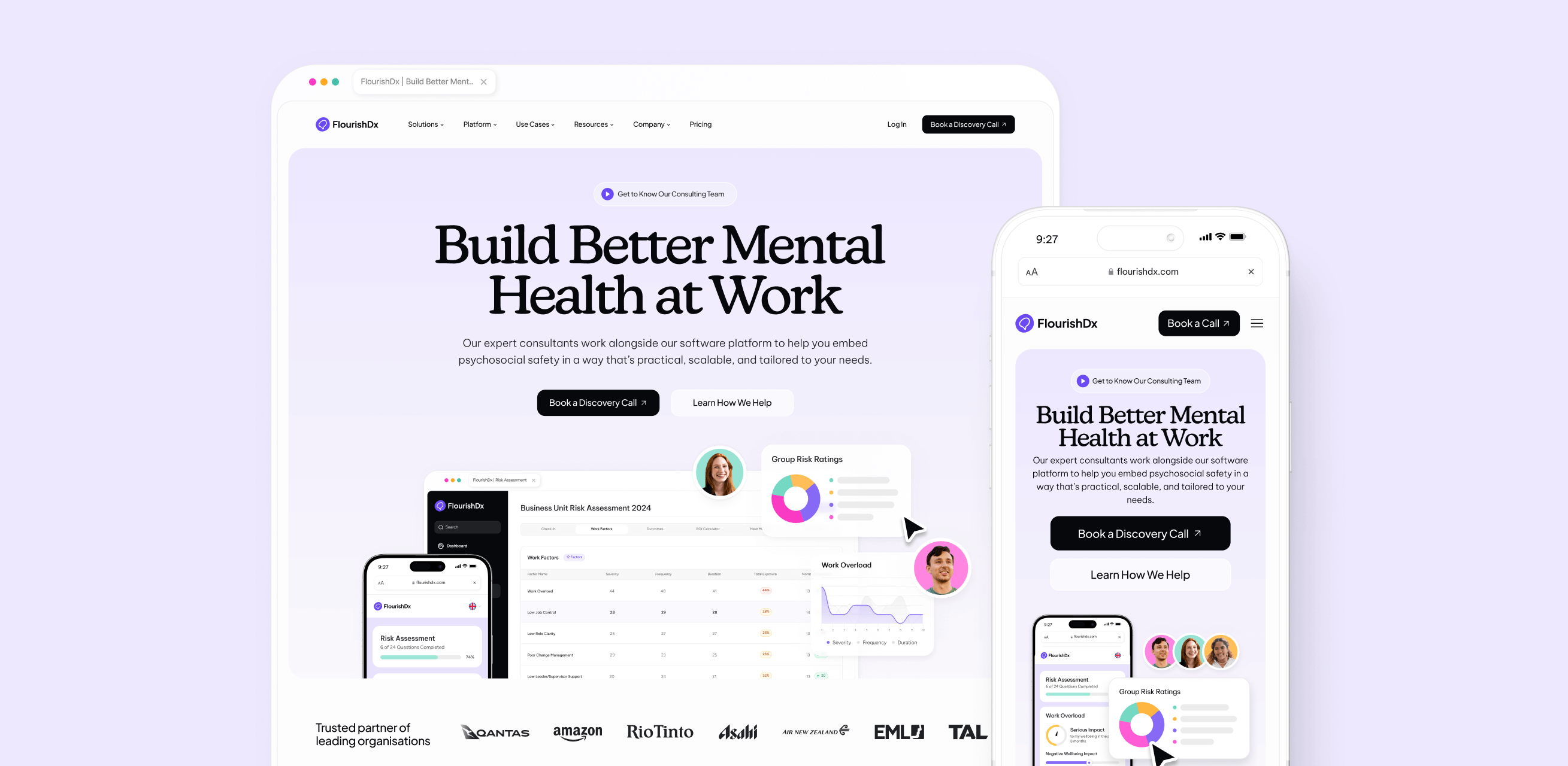
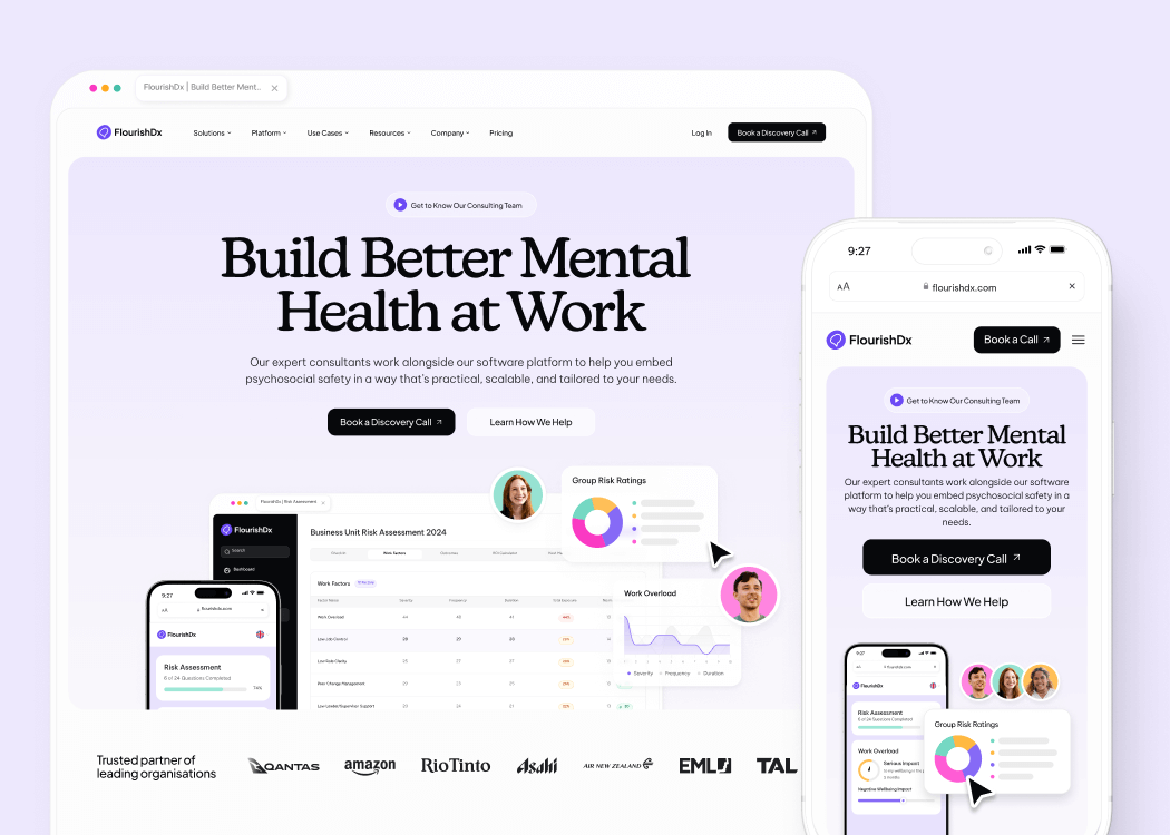
The previous website lacked clarity, structure, and visual maturity. While FlourishDx delivers an expert-driven product, the site didn’t convey that sophistication—pages were text-heavy, visually inconsistent, and offered little guidance for users trying to understand the platform.
Content around consulting, software, training, and resources was fragmented, making the offering appear disjointed and difficult to navigate. The site also struggled to communicate complex psychosocial concepts in a way that felt approachable or actionable for enterprise buyers.
Additionally, the visual execution lagged behind the updated brand direction. Product imagery was outdated, the hierarchy was weak, and the overall experience didn’t inspire trust or reflect the quality expected from a workplace mental health technology leader.
I redesigned the website to create a clear, modern, and highly structured experience that showcases the SaaS platform, elevates trust, and makes complex psychosocial concepts easy to navigate.The new design uses refined typography, a softer yet premium colour system, modular content blocks, and clear product storytelling. Each page guides users through the platform’s capabilities, supported by high-quality visuals, custom iconography, and UI mockups.Across long-form feature pages, I introduced strong hierarchy, scannable sections, and repeated design patterns—making the site intuitive, cohesive, and easily scalable as the product evolves.


