As part of the application process for the Graphic Communication Co-worker role at IKEA Nottingham, I was asked to design a visual direction for a “Back to Uni” campaign — a seasonal thread targeting students transitioning into university living. The concept needed to feel youthful, energetic, and unmistakably IKEA, while being versatile enough to roll out across point-of-sale signage, print collateral, and in-store displays.
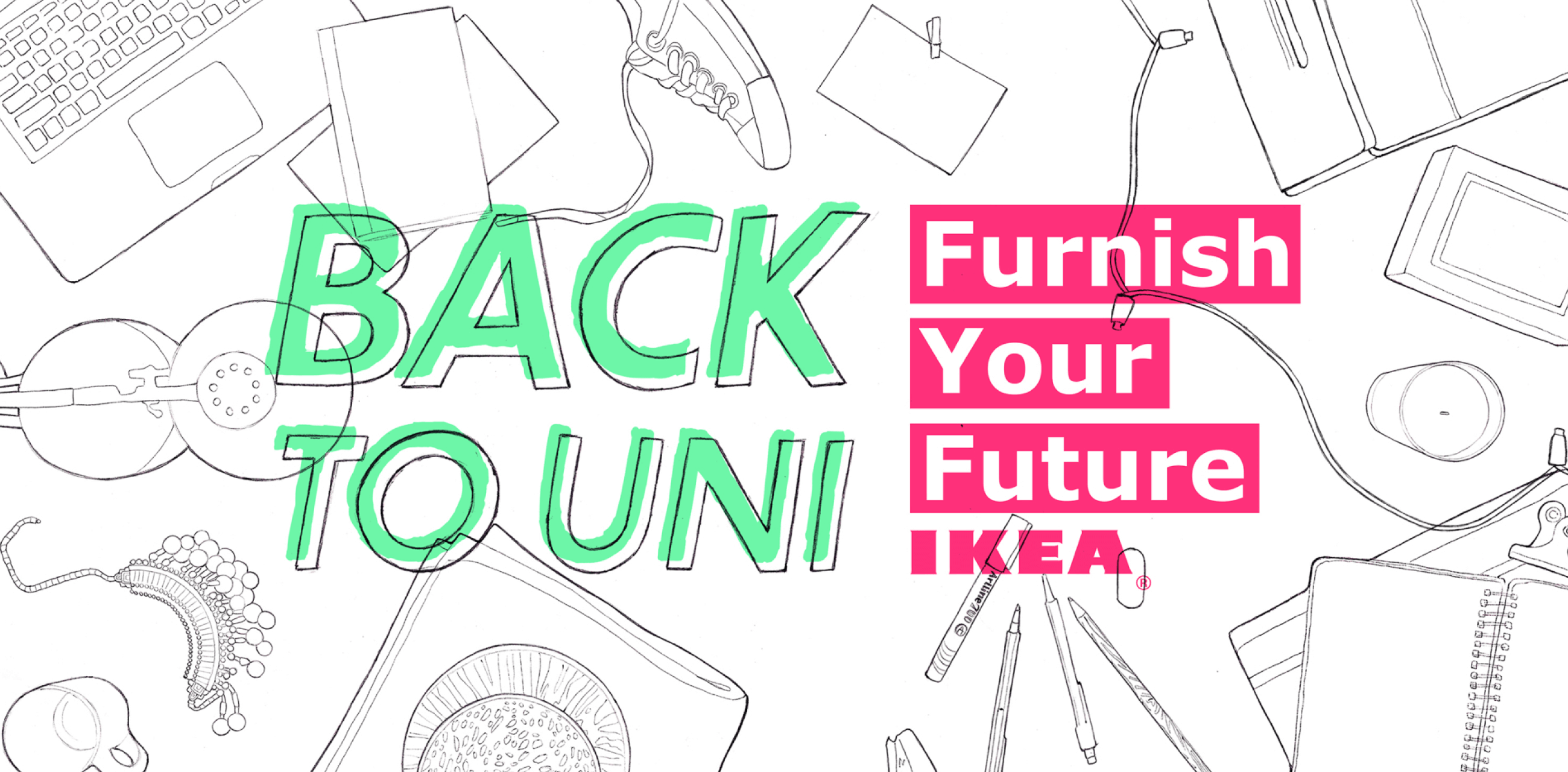
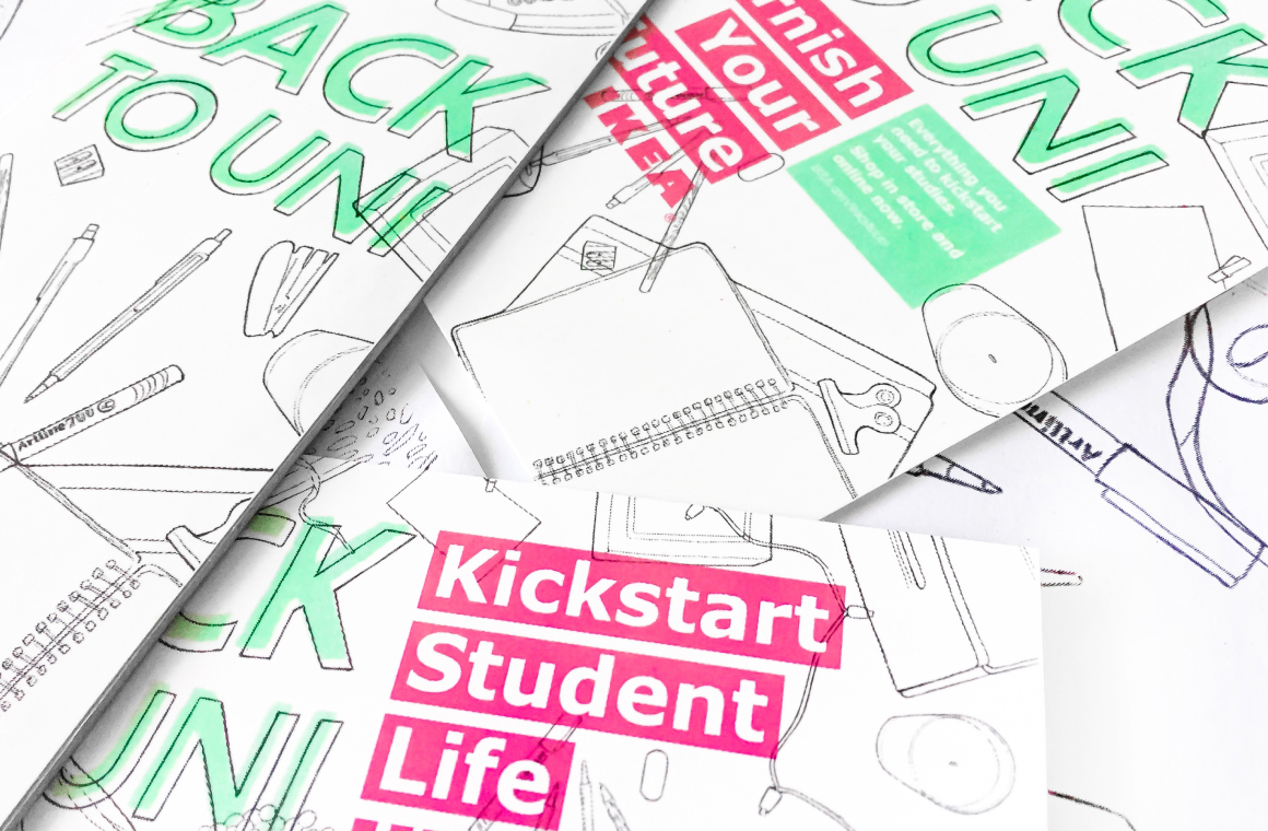
To express a playful, student-centric tone of voice, I illustrated a collection of familiar IKEA products in a loose, sketchbook style — representing the organised chaos of unpacking a first dorm room. Fluorescent green and pink overlays mimicked highlighter markings in a notebook, while keeping the visual system aligned with IKEA’s bold, graphic brand aesthetic. All drawings and typographic elements were hand-rendered, scanned, and converted to vector to ensure scalability across media formats.
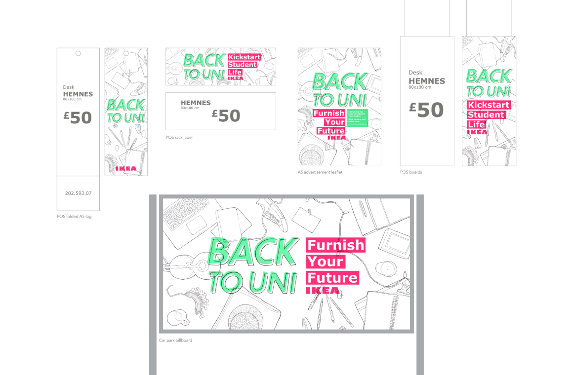
The concept presented a cohesive visual language that could flex across POS tags, posters, digital screens, and external signage. The work demonstrated an ability to design within the constraints of a global brand system while introducing a fresh visual voice — ultimately contributing to my successful placement at IKEA Nottingham, where I worked with a multidisciplinary creative team to produce customer-focused, in-store communication.

Hit me with your design thoughts.
Have questions or want to discuss your design needs? I'd love to hear from you! Simply fill out the form and I'll get back to you soon.
Rhiannon Davies, 2025